The Uninvited Mark: Branding, Composition and the British Screen
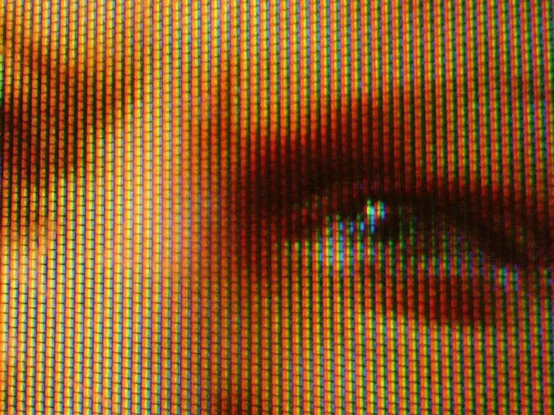
Photo: Martin Howard, CC BY 2.0, via Wikimedia Commons
In a darkened room, a figure crosses a landscape. The shot has been composed with care: the horizon sits where the director intended, the negative space carries a quiet tension, and the actor's face is held at the edge of the frame. Then, in the corner, a channel logo appears. It is small, brightly coloured and entirely uninvited. Within seconds, a promotional graphic slides into view beneath it. The landscape is still there, but it is no longer the whole picture.
British viewers have grown used to this arrangement. The digital on-screen graphic, or DOG, is now a familiar part of television presentation, and its streaming equivalent — the persistent watermark — has followed the audience online. The question is not whether broadcasters and platforms should identify themselves. They should. The question is whether the picture must remain permanently available as advertising space.
A mark on the composition
A frame is not a neutral container. Cinematographers, production designers and directors make decisions about where the eye should rest, how light falls and what the edges of the image are doing. A corner logo may seem trivial, but it occupies exactly the kind of negative space that composition often depends upon. It can pull focus from a performer, compete with subtitles or sit awkwardly alongside the broadcaster's own continuity graphics.
Those who defend persistent branding often argue that viewers barely notice it. That may be true for some, some of the time. It is not true for the viewer who has chosen a foreign-language drama and needs the lower part of the screen for subtitles, or for the viewer watching a widescreen film that has been framed for a rectangle now partly colonised by a logo. The mark is not merely a label on the glass. It is an element within the image, and it changes the terms on which the image is received.
The picture as advertising space
Broadcasters have legitimate reasons to brand. In a crowded electronic programme guide, a channel needs to be recognisable. Public service broadcasters in particular operate in a competitive environment, and their identities matter. Yet there is a difference between an ident at the start of a programme and a logo that remains throughout it. There is a further difference between a modest mark and the promotional furniture that now accompanies it: next-episode teasers, QR codes, countdown clocks and animated bugs that appear during the closing scenes of a drama.
These additions treat the programme as a shop window. They assume that the viewer's attention is always available for redirection, even at the moment a writer and director are trying to land an ending. In news and live sport, such graphics may be part of the form. In drama, comedy and film, they are an interruption. The viewer has not asked for a trailer in the middle of a story, and the story has not been made to accommodate one.
The viewer's contract
The British television ecology is unusual. Viewers pay a licence fee, subscribe to services, or do both. They accept advertising in commercial broadcasting and they accept that platforms need to distinguish themselves. But the relationship is not one-sided. The viewer brings time, attention and money; the broadcaster brings the work. A persistent mark suggests a certain distrust of that arrangement — a fear that without constant branding the audience might forget where it is.
That fear is worth examining. Cinema does not place a distributor's logo in the corner of every shot. Physical media does not usually interrupt the film with promotional graphics. The best streaming interfaces understand that the work is the attraction. British television has a strong tradition of presentation, from carefully made idents to the continuity announcer's voice, but that tradition was built around the boundaries of the programme, not its interior. The mark in the corner collapses the boundary and makes the frame itself part of the station's identity.
A cleaner settlement
A more respectful approach would not require broadcasters to abandon branding altogether. It would ask them to place it at the edges of the viewing experience rather than over the work. Idents at entry and exit, clear programme information in the guide, and a modest logo that fades after a short period would preserve identity without colonising the image. Promotional graphics could be kept away from drama and film altogether, or confined to moments when the programme has clearly ended. Streaming services could offer a clean-picture setting, and watermarks could disappear once playback is under way.
There are practical questions, of course. Advertising and navigation are real pressures, and no broadcaster will redesign its presentation overnight. But the principle is straightforward: the picture belongs to the work. A logo in the corner may be small, but it is not neutral. It tells the viewer that the frame is a surface to be branded. A proper view asks for something simpler — that the frame be left alone.